
Cracker Barrel Just Dropped a Fresh Look You Need to See
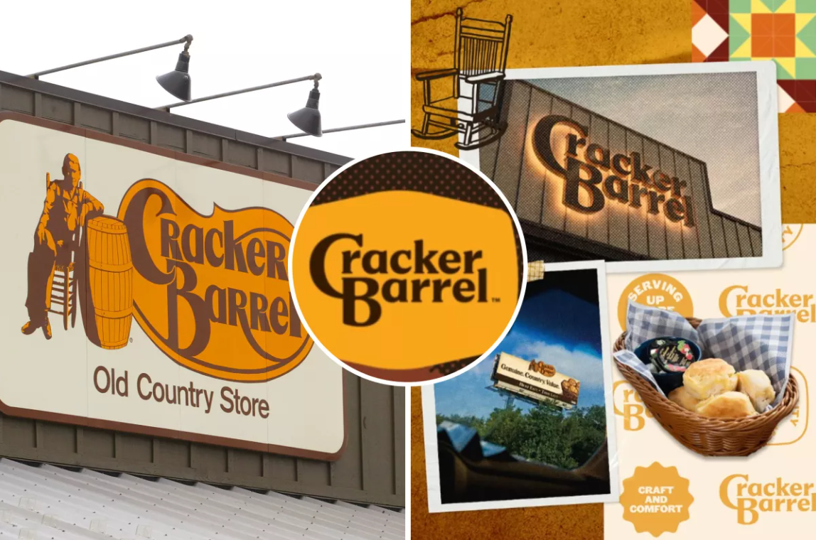
Cracker Barrel just dropped a fresh look you need to see, unveiling a new logo, updated menu items, and store makeovers that fans are loving. After nearly 50 years with its iconic imagery, the Old Country Store takes a bold step to modernize while keeping its Southern roots.
The new design, revealed on Tuesday (Aug. 20), drops the classic figure of a man leaning against a wooden barrel. For the first time since 1977, the logo will feature only the restaurant’s name, styled in its trademark gold and brown tones.
The change is part of Cracker Barrel’s wider “All the More” campaign. This initiative includes updated branding, refreshed menus, brighter interiors, and collaborations with leading country music artists.
Returning to the Past While Moving Forward
While the redesign might feel like a radical change to long-time fans, it brings Cracker Barrel back to its roots. The first location opened in Lebanon, Tennessee, in 1969, with a simple text-only logo. The familiar image of a man and a barrel did not appear until the company was eight years old.
In a formal statement, Cracker Barrel described:
“Based on our iconic gold and brown, the new imagery is even more inherently tied to the barrel shape and word mark that started the process.”
The firm indicates the new design is the fifth version of the Cracker Barrel logo. With each revision, officials say, it’s a reflection of customer expectations as well as the company’s need to remain relevant without sacrificing who it is.
Colors That Tell a Story
Cracker Barrel did more than update the typography in its new logo. The company drew its fresh color palette directly from popular menu items, using timeless favorites like farm-fresh scrambled eggs and buttermilk biscuits to create warm, inviting tones.
Though the design philosophy highlights this effort from the company to make its branding less corporate and more aligned with its Southern comfort food heritage.
A Partnership with Country Music
As part of efforts to give the campaign a boost, Cracker Barrel partnered with country artist Jordan Davis, who is featured in a new advertisement.
The collaboration came naturally to Davis:
“Cracker Barrel has always been home to me. It’s where the food is just right, the people treat you like family, and the pace lets you slow down and catch your breath. That’s something I try to bring to my music, too—real moments that feel right and bring people together.”
The collaboration highlights how far Cracker Barrel goes in tying itself to American country culture, a mainstay of the brand since day one.
What Customers Can Expect
As part of the logo roll-out, Cracker Barrel is providing customers with a special reason to visit. On August 23 and 24, 2025, visitors to almost 660 restaurants across the United States will be treated to a free Classic Side with any purchase.
Marketing-wise, the timing is not coincidental. The promotion not only thanks loyal customers but also invites them to visit stores and see the new look and menu for themselves.
A Modern Makeover for a Traditional Brand
The logo is just one aspect of Cracker Barrel’s ongoing evolution.
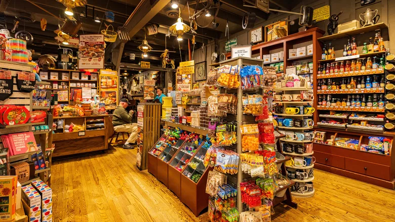
Last year, the company began a series of interior remodels. The original design—filled with antique Southern décor, rustic wood finishes, and vintage Americana—was brightened to create a more open and modern dining environment.
Chief Marketing Officer Sarah Moore described the process as delicate but necessary:
“We’ve been transparent about our goal of making our stores brighter and more welcoming, while still maintaining the country hospitality and charm we’re known for.”
Moore pointed out that the company’s underlying values never alter, but that today’s patrons expect tradition and surprise when dining out.
Why the Change Matters
Logo makeovers like this reflect wider trends across the restaurant industry, say branding experts. As youth demand more contemporary dining, heritage chains are forced to comply.
For Cracker Barrel, success has always come from nostalgia, comfort, and Southern hospitality. The challenge now is to modernize without losing that identity.
The move to a cleaner, text-only logo reflects a broader design trend in food and hospitality. Minimalism and adaptability now dominate the industry. A simpler logo performs better on digital platforms, mobile apps, packaging, and social media. These are areas where Cracker Barrel hopes to build stronger engagement.
A Brand with Deep Roots
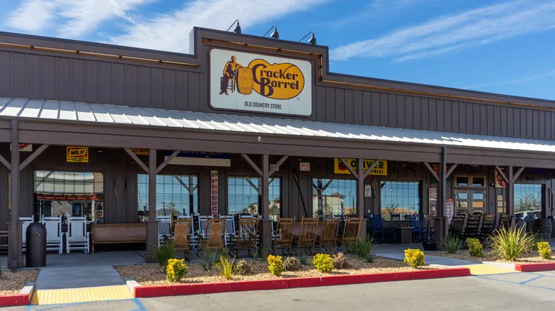
Cracker Barrel opened in 1969 as a small country restaurant and general store in Lebanon, Tennessee. The concept combined homestyle food with a gift shop with candy, rocking chairs, Americana collectibles, and other gifts.
The chain now operates nearly 660 locations across 45 states. It has become one of the most recognizable names in casual dining. Known for hearty breakfasts, fried chicken, biscuits, and rustic country décor, Cracker Barrel stands as an icon of Southern lifestyle and family dining in America.
Looking Ahead
The launch of a new logo means that Cracker Barrel is embracing the future while holding fast to its roots. With new graphics, redesigned menus, and new advertising efforts, the company is betting on a mix of heritage and innovation.
As Sarah Moore personified:
“Our story has not changed. Our values have not changed. What’s changing is how we tell that story—making it sound as warm, as genuine, but fresh for today’s guests.”
For more information about how the brand has changed and what else they have to offer these days, visit the Cracker Barrel official website.
